
In 2025, the internet is no longer desktop-first — it’s mobile-first by default. According to global data, 62.45% of all website traffic now comes from mobile devices and we need a Mobile-Optimized Website. This means that the majority of your potential customers are viewing your site, reading your content, or making purchase decisions directly from their smartphones. Whether someone is researching a service, scrolling through social media, or completing an eCommerce transaction, mobile is their primary touchpoint with your brand.
This shift has completely transformed how businesses should think about web design and digital marketing. A website that looks great on a computer but struggles to perform on mobile is no longer competitive. Poor mobile experiences lead to lower search visibility, higher bounce rates, and lost conversions. In today’s mobile-driven ecosystem, mobile optimization isn’t an enhancement — it’s a foundation.
What Mobile-First Web Design Really Means
Mobile-first web design is a design philosophy that prioritizes smartphones and tablets as the starting point for development, rather than treating them as secondary or “scaled-down” versions of a desktop site. In this approach, the website is built and tested first for smaller screens, focusing on simplicity, usability, and speed. After that, the layout is expanded for larger screens like desktops and laptops.
Designing for mobile first ensures that every visitor — regardless of device — gets a fast, smooth, and engaging experience. This approach considers mobile users’ behavior: they scroll vertically, tap instead of click, and prefer short, focused interactions. A mobile-first website embraces these habits, offering concise content, quick navigation, optimized images, and readable fonts.
From a business standpoint, mobile-first design is essential because Google uses mobile-first indexing. This means that Google primarily evaluates and ranks your website based on how your mobile version performs. A site that loads slowly or doesn’t render properly on mobile can severely damage your rankings — even if the desktop version works perfectly.

Mobile-First vs Mobile-Last: The Key Differences
When comparing mobile-first and mobile-last (desktop-first) design approaches, the difference lies in intent. Mobile-first design begins with constraints — smaller screens, limited space, and touch navigation. These constraints encourage designers to prioritize only the most important content and features, resulting in faster, cleaner, and more user-focused websites.
On the other hand, mobile-last or desktop-first design starts with larger layouts, heavy images, and detailed menus, which often fail to translate well onto mobile devices. Shrinking a large design down doesn’t just distort visuals; it can break the user experience entirely. Buttons may become hard to tap, navigation becomes cluttered, and loading times increase due to unoptimized assets.
In short, a mobile-first approach builds up, while a desktop-first approach scales down — and in the mobile era, building up is always smarter.
Why Mobile Can’t Be Ignored in 2025
The numbers speak volumes. As of 2025, over 96% of internet users access the web through mobile phones, even if they also use other devices. In regions like Africa, mobile accounts for over 69% of web usage, while in India, it drives nearly three-fourths of all eCommerce traffic. Even in the United States, where desktop usage remains relevant, 56.75% of all web traffic now originates from mobile devices.
For businesses, this shift has direct consequences. Research shows that companies adopting mobile-first design experience 30% higher engagement and up to 25% faster checkout conversions compared to those with desktop-centric sites. Furthermore, 53% of users abandon a website if it takes longer than three seconds to load on mobile. These users rarely return, which means slow or unoptimized sites are effectively turning away paying customers.
Ignoring mobile optimization doesn’t just mean falling behind competitors — it means being invisible in the spaces where your customers already are.

Mobile-First Design and Its SEO Advantages
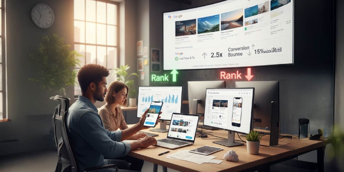
Mobile-first design directly influences SEO (Search Engine Optimization). Since Google’s mobile-first indexing policy became standard, your mobile site now determines your search visibility, regardless of how your desktop site performs. If your mobile site is slow, poorly structured, or missing important content, Google will rank you lower — even if your desktop version is flawless.
A well-optimized mobile site helps you climb search rankings because it improves the very metrics Google values most:
- Page speed
- User experience
- Engagement time
- Bounce rate
Websites that load in under two seconds tend to rank higher, as they retain visitors and encourage deeper interaction. In fact, 80% of top-ranking websites globally are now fully mobile-optimized. That’s not coincidence — that’s Google rewarding good design.
Speed Is the New Currency
When it comes to conversions, speed directly equals sales. Studies consistently show that faster websites convert better. A page that loads in one second can convert 2.5 times better than a page that takes five seconds. Retail giant Walmart saw a 2% increase in conversions for every one-second improvement in mobile load speed, while Amazon estimated that a 100-millisecond delay could cost them 1% in revenue.
Mobile users are especially impatient because they expect instant access, even on slower data connections. Compressing images, using efficient caching, and minimizing code bloat can dramatically reduce load times. For businesses, these optimizations mean not just a better experience but tangible revenue growth.
Conversions and the Rise of Mobile Commerce
The mobile-first revolution has transformed online shopping into a mobile-commerce economy. Currently, 35% of all eCommerce conversions come from mobile devices, and that number continues to grow. Modern mobile users now prefer one-tap checkouts, digital wallets, and app-style navigation that make the buying journey seamless.
When your website is mobile-optimized, your sales funnel becomes smoother. Visitors can find products faster, navigate with ease, and complete transactions without switching devices. This fluid experience reduces friction — and in digital marketing, friction kills conversions.
Mobile-first design ensures your visitors never hit that wall.
Enhancing User Experience (UX) and SXO
User experience (UX) and Search Experience Optimization (SXO) go hand-in-hand in mobile-first design. SXO is the evolution of SEO — it focuses not just on attracting clicks but on delivering satisfaction once users land on your site. A mobile-first website enhances both.
When users can navigate effortlessly, read content clearly, and complete actions without frustration, their engagement metrics improve. They stay longer, view more pages, and are more likely to convert. These behavioral signals — reduced bounce rate, higher dwell time, and increased interaction — feed directly into SEO rankings.
A well-designed mobile site doesn’t just look good; it feels good to use. That emotional ease translates into measurable business growth.
The Cost of Sticking to a Mobile-Last Strategy
Businesses that still rely on desktop-first design face serious drawbacks. First, they suffer in search results because Google prioritizes mobile-optimized websites. Second, poor usability leads to frustrated visitors who leave quickly, increasing bounce rates. Third, brands that ignore mobile optimization risk looking outdated and disconnected from user behavior.
A poor mobile experience also affects trust. When users struggle to navigate your site or complete actions, they subconsciously question your professionalism. In a competitive digital marketplace, even small inconveniences can drive customers to competitors. Simply put, mobile-last means market-last.
Real-World Examples of Mobile-First Success
Several major brands have proven the tangible value of mobile optimization:
- Walmart improved its mobile speed by one second and saw a 2% increase in conversions.
- BBC reduced its mobile load time by 60%, which led to a 49% rise in mobile sessions.
- Airbnb redesigned its platform with mobile-first principles and achieved a 25% boost in conversions along with improved retention.
These examples highlight that even minor improvements in mobile performance can produce significant returns.
Future-Proofing with Mobile-First Design
Mobile-first design isn’t just a current best practice — it’s a strategy built for the future. As 5G networks, AI-powered personalization, and voice search continue to shape digital behavior, mobile-first websites will naturally adapt.
Emerging technologies such as Progressive Web Apps (PWAs) blur the line between mobile apps and websites, offering offline functionality, push notifications, and lightning-fast load times. Similarly, as more users browse through in-app browsers (like Instagram or WhatsApp), your site’s mobile optimization becomes critical for visibility and performance.
By 2025, more than 70% of all online time will be spent within mobile apps or browsers, which means your website must perform flawlessly wherever it appears.
Regional Trends: Mobile Use Around the World
Mobile dominance isn’t uniform across the globe — it’s shaped by culture, infrastructure, and technology.
In Africa, mobile usage surpasses 69%, with many users skipping desktops entirely due to affordable smartphones. In India, rapid smartphone penetration has made mobile-first SEO a top priority for businesses. North America maintains strong mobile engagement at around 57%, especially for leisure and entertainment, though desktops remain common in professional settings. Across Asia-Pacific, mobile accounts for 67% of total web activity, driven by social commerce and mobile payments.
Understanding these regional trends helps businesses tailor content and design strategies for local audiences — because mobile behavior isn’t just global, it’s cultural.
The Mobile-First Optimization Checklist
To build a successful mobile-first website, ensure you:
- Use responsive grids and flexible layouts.
- Compress and optimize images (use WebP or AVIF formats).
- Implement lazy loading for faster performance.
- Use clean, readable typography and clear visual hierarchy.
- Prioritize touch-friendly navigation and sticky CTAs.
- Keep content concise and scannable.
- Test performance across multiple devices and browsers.
- Add structured data (JSON-LD) to enhance SEO.
- Use CDNs and caching to minimize latency.
- Regularly audit your site’s Core Web Vitals to ensure top performance.
Following these steps ensures your mobile-first website not only loads faster but also ranks higher and converts better.
Go Mobile-First or Get Left Behind
The future of the web is mobile, and the future is already here. With over 62% of global traffic now coming from smartphones, businesses that continue to rely on desktop-first design risk falling into digital obscurity.
A mobile-first website ensures that your brand is discoverable, engaging, and trusted — no matter what screen your audience uses. It combines speed, usability, and SEO into a single, seamless experience that aligns with how people live and browse today.

If you want to stay relevant, competitive, and visible in 2025, going mobile-first isn’t optional — it’s essential. Audit your site today, optimize for mobile, and watch how better design translates into better results.
📱 Ready to build a mobile-first website that delivers results?
Let’s create a fast, responsive, and SEO-friendly experience that turns visitors into customers.
👉 Contact 18Pixels
FAQs
Mobile-first design focuses on creating a website for smartphones first, ensuring it’s fast, responsive, and user-friendly on smaller screens before adapting it for desktops.
Because over 62% of global web traffic now comes from mobile devices, a mobile-optimized site ensures better SEO rankings, engagement, and conversions.
Yes. Google uses mobile-first indexing, meaning your mobile site determines your search ranking and visibility.
A 1-second improvement in mobile load time can increase conversions by up to 2%. Slow pages lead to high bounce rates and lost revenue.
Non-optimized websites experience lower rankings, poor user experience, and reduced conversions—ultimately driving visitors away.
Don’t stop here—discover more in our latest blog –
Full-Stack Web Development in 2025: Technologies Every Business Should Know
How UI/UX Design Directly Impacts Conversion Rates: Real Data, Real Examples
Choosing the Right Tech Stack: A Business Owner’s Guide to Avoiding Costly Mistakes
Post Views: 489


